Client: Poet Brewery & Bar
Tasks: New Brand Development, packaging design

Poetic brewing is the main idea behind the new craft brewery concept developed by DDH Branding Consultancy in partnership with Moscow local micro-brewery “Poet Brewery & Bar”.
The “Poet Brewery & Bar” owners believe that the art of craft is in fostering experiences for their consumers, through creating authentic beer.
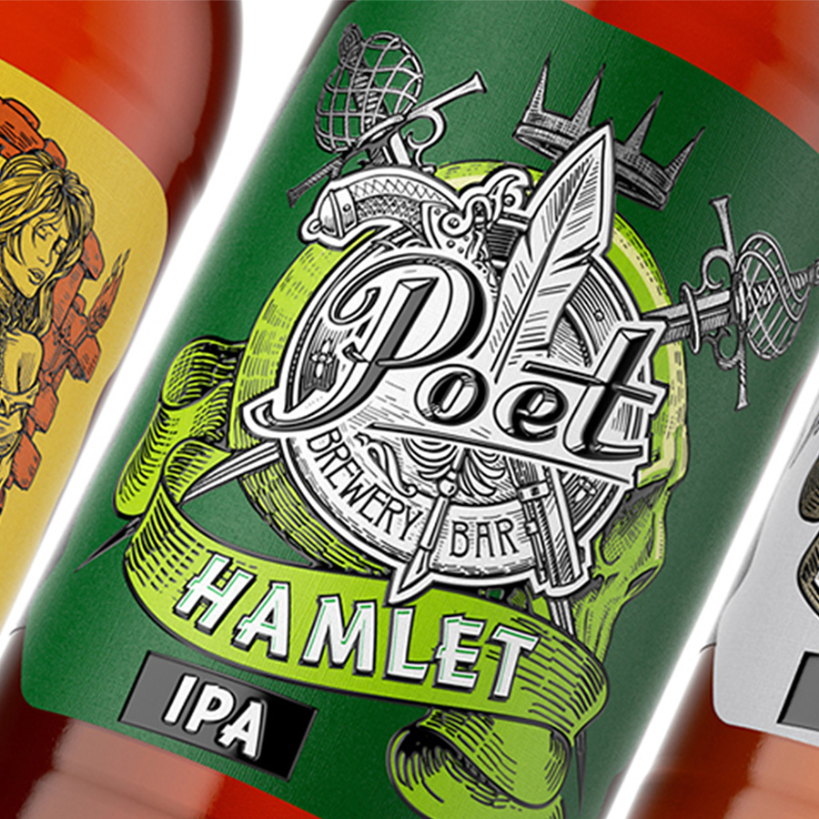
The agency worked on “Poet” beer brand and created a complete visual identity and unique presentation for each new brew. Own custom typographies were used to create the main logo of the brewery and names for each brew.
Each brew has its own unique illustration to represent each poem corresponding to each beer. The poems are not pictured straightforwardly, the main ideas are implied in the design, of each beer type, which makes it even more exciting to look for the design elements.
Rolled out in March 2018, the new brand identity stands for bold colour, strong typography and brand symbol, crafted illustration and a touch of irreverence. The result is a refinement of our last year spent creating together – a beer range that owns where it came from, supporting the status of Moscow’s leading craft brewer.
Client: Poet Brewery & Bar
Tasks: New Brand Development, packaging design
Poetic brewing is the main idea behind the new craft brewery concept developed by DDH Branding Consultancy in partnership with Moscow local micro-brewery “Poet Brewery & Bar”.
The “Poet Brewery & Bar” owners believe that the art of craft is in fostering experiences for their consumers, through creating authentic beer.
The agency worked on “Poet” beer brand and created a complete visual identity and unique presentation for each new brew. Own custom typographies were used to create the main logo of the brewery and names for each brew.
Each brew has its own unique illustration to represent each poem corresponding to each beer. The poems are not pictured straightforwardly, the main ideas are implied in the design, of each beer type, which makes it even more exciting to look for the design elements.
Rolled out in March 2018, the new brand identity stands for bold colour, strong typography and brand symbol, crafted illustration and a touch of irreverence. The result is a refinement of our last year spent creating together – a beer range that owns where it came from, supporting the status of Moscow’s leading craft brewer.
